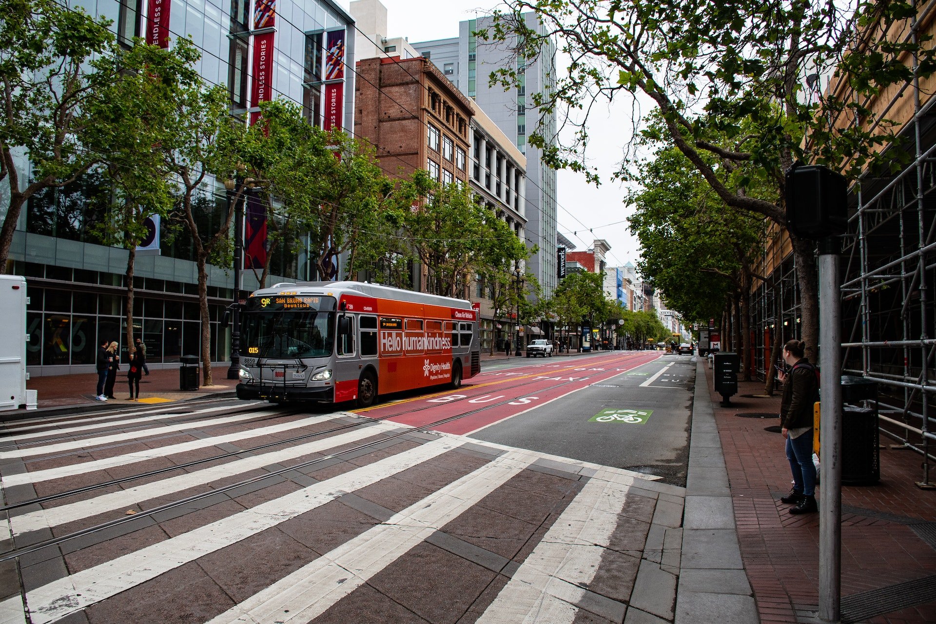
Columbus Public Transit 1.0
This past spring the Mid-Ohio Regional Planning Commission released the results of their Leaders Listen survey concerning transportation in the region. With the region expected to grow its population 30% by 2050 this is of special concern. From the survey responses they came away with three actionable insights, one of which is that ‘most feel it is not convenient to walk, bike, bus for work or errands’. This is something I very much agree with as well.
I currently live in Grandview Heights, within .25 miles of me there are 5 bus stops for two COTA lines. I previously worked north of the city in Polaris at a business that had 5 stops for 1 line within a half mile. I normally started work at 9am and it was about a 25 minute drive. Taking a bus to work would require me to leave, at the latest, 7am in order to arrive at the bus stop closest by 8:15am and walk the half mile to the office building. The other option is to arrive at 9:30am, by which time I would be late for standing meetings we had in the morning. Now understandably I do live pretty far from Polaris, but even when I lived 2 miles from my office building it was a 25 minute transit trip with about a mile of walking to and from bus stops. Biking would have been technically faster but very dangerous and possibly illegal depending on what roads I took.
This got me thinking about what COTA accessibility and service times look like for different areas of the city. I decided to create an interactive web map to explore this. First I decided to use census tracts as the starting points using the centroid point of each tract as the exact starting location. I only used census tracts that had a COTA line running to them so this map does not explore census tracts that aren't covered at all by public transit. I downloaded the American Community Survey 2022 5 year data for the census tracts and using that data I came up with five different kinds of tracts to look at that I felt would be important customer bases for COTA. First were the most population dense ones defined as more than 8,000 people per square mile (this works out to be the tracts above the 80th percentile) as population dense areas are ideal for public transit accessibility.
For the next three I took the 90th percentile of tracts for the GINI Index of Income Inequality, the population that uses public transit for commuting, and those that fall below the poverty line that use public transit for commuting. Finally I took the census tracts where 50% or more of the population falls below the poverty level. I split their potential destinations into three segments top employers in the city, high density business tracts and finally some fun locations since access to not just work is important as well. Top employers was based on multiple sources from how large they are to other rankings. I used the open data from the city on where industrial, medical, retail and office facilities where located and condensed them based on the census tract location. This gave me the densest business districts, unfortunately I could not find any other data to help with that so this was the best option I came up with.
After downloading the COTA data I created the transit network in my GIS software. First for all the centroid points in the five census tract groupings I ran service accessibility based on 15, 30, 45, and 60 minute travel time frames for different time groups on Monday, Saturday, and Sunday. I based the spread of different travel times for each day on how the census data split up their when do you leave for work data. I chose Monday, Saturday and Sunday based on the variations in service from COTA with most lines running Monday through Friday the same and Saturday and Sunday differing. Then for each combination of start and end point I ran a OD Cost Matrix in 10 minute intervals for the same time groups. In order to visualize this on the map I ran routing analysis as well to come up with a general route for each combination, it should be noted that there may be actual variation in this at different times, especially if the area is serviced by multiple lines. That route served as the basis for me to animate the mean amount of time a trip from A to B would take.
Stay tuned for some updates to this map. I am looking to add some additional functionality to the interactive parts of the map and also optimize the time lapse feature further.